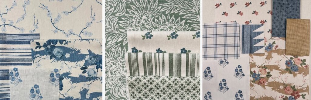
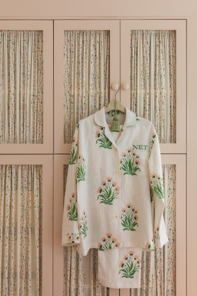
Designer, cookbook author, and entertainment expert Nathan Turner is debuting his first fabric line, inspired by his Northern California childhood. The look is relaxed but refined, with classic motifs like chintz, quilting, animal prints, and plaids seen in new ways through Turner’s lens. Each print comes in a range of subtle, slightly sun-bleached hues, from neutrals like taupe to soft blues, greens, and pink and gold tones that bring charm to any room.
I spoke with Nathan to get some insight into his process and how he looks at fabric, color, and pattern.
5 Questions With Designer Nathan Turner
How Did the Collection Come About?
Nathan Turner: I am the co-creative director and a partner at Wallshoppe. The founders are family friends and approached me with an idea for a direct-to-consumer wallpaper company, and I was in. From the beginning it was about creating fun, colorful prints in a very usable way.
How Does Your California Background Inform Your Fabric Designs?
NT: My upbringing in California played a huge part in designing the fabric collection. It informs so much of my decorating and overall aesthetic. I love color and a relaxed sensibility. Stylish rooms cheerful colors and patterns that feel relaxed and liveable.
What’s the Most Important Thing to Consider When Picking a Fabric?
NT: When choosing fabrics, it’s really important to consider the end use. Light airy linens with big patterns on curtains are great, while something with a little more heft like a texture or woven is great for a sofa. Most importantly when choosing color or pattern, pick what makes you happy…it’s an investment and something you’ll be looking at every day, so go with your gut. If you have an immediate positive reaction to something…go with it!

How Do You Match the Print With the Project?
NT: I think I match the print to the person more than the project. I really tune into my clients’ likes and dislikes and the way they live. If they’re more adventurous, its bold colors and big patterns…if a little more subdued, maybe it’s a simple stripe. I really look at how my clients dress as well…if someone feels good in blue and they wear it a lot…they’ll certainly like living in it as well.

What’s Your Advice for Mixing Prints?
NT: I love mixing prints and patterns…for me the key is staying in the same color palette. If you do that you can pretty much layer a lot of prints in one room and it’s cohesive and not overbearing.
Story by Stephen Treffinger / Photos Courtesy of Nathan Turner

Subscribe to TABLE Magazine’s print edition.
