On the evening of December 13, 2023, Keith Recker, Colleen Simonds, and Anne Dickson hosted a lecture on Color(s) of the Year at TABLE Studios, observed which global authority on color picked what tone, and then turned the question on themselves.
Anne, founder and owner of floral design store Fox and The Fleur, found blushing brides holding peach- colored flowers, while nationally known interior designer Colleen Simonds, searched for interiors with pale pink walls before pronouncing, “I don’t think I’ve ever had a client ask for a peach fuzz room.”
Meet Pantone’s Color of the Year 2024: Peach Fuzz 13-1023. Described by Leatrice Eiseman, Executive Director of Pantone Color Institute as, “a shade that resonates with compassion, offers a tactile embrace, and effortlessly bridges the youthful with the timeless.” This association does very little in the way of a color description. Is it pink? Is it orange? Is it a soft pink- orange? Is it coral? Is it floral? It is shade of blush? A skin tone? Apricot? It’s peach. And yet, much of what captures our attention is everything it isn’t. Take TikTok for example.
TikToker @ama8189 believes that Pantone’s choices are paid for clandestinely by companies. This conspiracy theory includes Color of the Year 2017 Greenery 15-0343 and Android’s green text bubbles or Whole Foods, depending on your mobile device. Other potential licensing deals linked Airbnb with Pantone 16-1547 Living Coral in 2019 and Microsoft Teams with Pantone 17-3938 Very Peri in 2022. Whether its conspiracy, or just business, or pure chance, the discussion questions the intentionality behind Pantone’s chromatic prediction and misleading marketing.
For the hues of Color(s) of the Year, as Keith Recker stated towards the end of the evening, “the process is not transparent,” but not in any sinister way. The Color of the Year’s media and press package reveals that a team of global color experts at the Pantone Color Institute comb the world looking for new color influences. This can include the entertainment industry and films in production, traveling art collections and new artists, clothing, all areas of design, aspirational travel destinations, new lifestyles, playstyles, or enjoyable escapes, as well as socio-economic conditions. They meet face to face twice a year to discuss what they’re seeing, and the Color of the Year emerges from these convenings. The choice is kept as secret as possible until the annual reveal which usually happens on the first Friday in December.
Recker’s 2024-25 color forecast, formulated in April and May of this year, looked at facets of fashion and art that both supported and contradicted aspects of Pantone’s Color of the Year. His process of listening is, as Recker described it, “seeking and finding what will satisfy a need.” In a time of unease, Peach Fuzz and its corresponding name serve “as an idea as much as a feeling.” Further feelings strutting down runways and coming out of design studios that Recker presented were a prevalent need for comfort and refuge in the form of pastels, an investigation of humor and vigor delivered by highly saturated colors, positive engagement with a range of constructive reds, and even the notion of centeredness and mindfulness expressed by humble, hard-working neutrals.
In the weeks and months prior to Pantone’s Color of the Year announcement, other influential companies unveiled their choices. Echoing Peach Fuzz were HGTV’s Persimmon and WGSN x Coloro’s Apricot Crush, calling to mind “the nutritional properties of vitamin- and antioxidant-rich oranges and apricots.” On the opposite end of the color spectrum is Benjamin Moore’s Blue Nova. Behr’s Cracked Pepper, and Glidden’s vanilla-toned Limitless, expored the dark and light poles of the neutral category. All of these were explored in Recker’s presentation not as color samples but through a wide range of imagery, from the glazes of ceramics by Toshiko Takaezu and the wash on a pair of Valentino’s trompe-l’oeil jeans made from glass-bead-embroidered gazar.
As the colors and their potential applications piled up, many of the attendees’ questions were around where to use them, to which Simonds said, “people want rules so they don’t make mistakes, but there are no rules.” Considering these absolutely insane and vociferous times, the idea that we all need to relax and perhaps be a little more playful feels fitting and very Peach Fuzz-y. In fact, Recker observed that, while he would have chosen an electric shade of celadon, “the more you think about Peach Fuzz, the more you like it.”
If Peach Fuzz is an accurate projection of the year to come, there will be many floral centerpieces and interior interpretations on Pantone’s Color of the Year. These demonstrate different schemes on the feelings and associations of a hue that both Dickson and Simonds believe can go either direction—playful and soft or luxurious and grounding. Peach Fuzz is a neutral enough color for cultural phenomenons to find resonance within it. We may find ways to locate these phenomena, or more specifically the human experience, gently nestled between somewhere in its pink and orange tint.
Story by Alyssa Vasquez
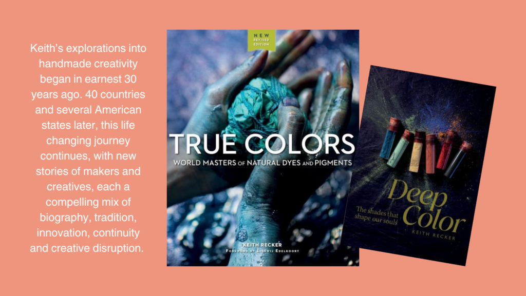
Books by Keith Recker:
 True Colors
True Colors is about artists who create color from natural materials and about the historical importance and environmental sustainability of this practice. Deep conversations with 26 artisans from every part of the globe reveal their wisdom, traditions, and know-how—and suggest that we ignore what they know at our peril.
Deep Color
Color is a powerful force in our lives. It is a major influence in visual and verbal communication and on the decisions we make every day. Deep Color unpacks all the shades of the rainbow (plus black, white, and pink) with little-known facts, stunning visuals, and a critical perspective on color and the nonverbal meanings it carries.
Photo credits clockwise from top left: Edoardo Piermattei, Klein Reid, Joseph Altuzarra, Ok Pok Tok, Nick Cave, Christopher Wolston, Angel Oloshove at form+concept.
Subscribe to TABLE Magazine‘s print edition.

