Spring paint trends can give you an inside look at what tones may coordinate with your everyday life. Explore our top picks for 2024 with swatches from Benjamin Moore that bring minimalism, maximalism, and nature into your home.
Minimalism
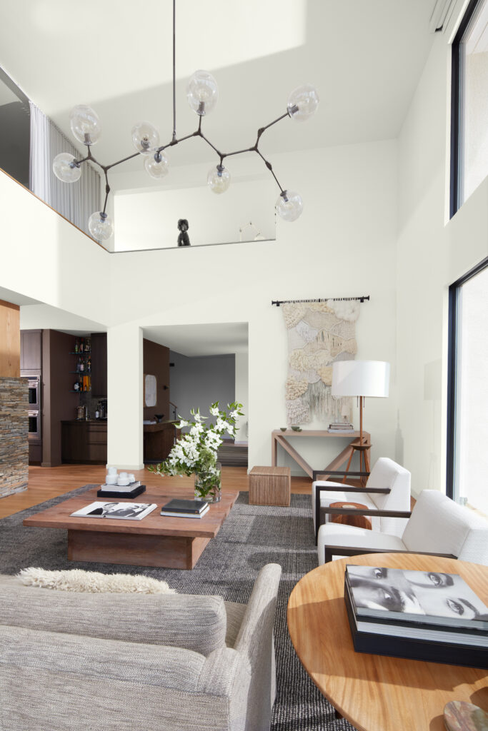
As we adopt a more focused and positive outlook for the future, crisp and uncluttered spaces provide clarity of mind, making minimalism a style of choice. This aesthetic continues to evolve by infusing warmth through color, natural materials, and texture, as well as notes of Japanese and Scandinavian design. Embracing natural light and then drawing connections between tranquil landscapes outside and interior comforts result in the truly welcoming rooms we crave.
Color selections are infused with warmth while remaining fresh and rejuvenating. Slightly tinted neutrals provide variety and softness for an enveloping and comforting ambiance.
Painted using Decorator’s White OC-149
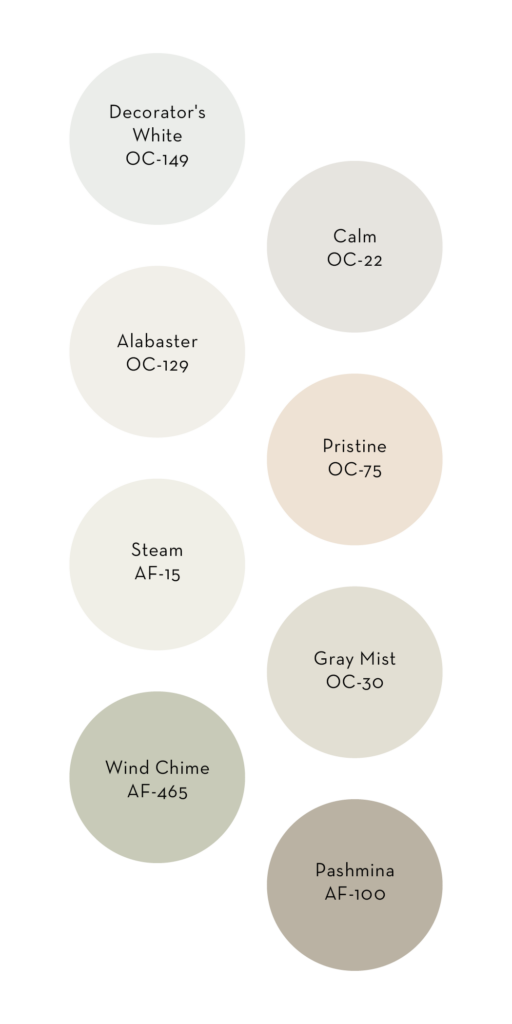
Decorator’s White OC-149:
A designer favorite year after year, Decorator’s White has just a touch of cool gray for a sleek, stylish appeal while making this an incredibly versatile hue.
Calm OC-22:
Per its name, a slight touch of grayed violet exudes a soothing mood, making this color a very popular choice.
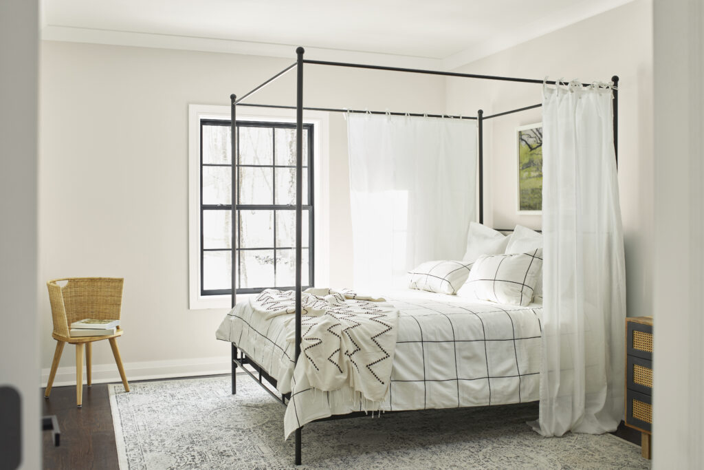
Painted using Steam AF-15
Steam AF-15:
For a white that is just slightly softened and infinitely versatile, Steam is an ideal hue for both walls and trim.
Pristine OC-75:
This delicate off-white has a soft blush cast, making it both welcoming and flattering.
Painted using Gray Mist OC-30
Alabaster OC-129:
A touch of pink brings warmth to this white hue while maintaining a crisp look.
Gray Mist OC-30:
Hushed greige tones contribute to the versatile quality of this hue, particularly when working with neutral color palettes.
Painted using Wind Chime AF-465
Wind Chime AF-465:
A soft celadon, Wind Chime delivers a sense of harmony and tranquility that is perfect for any room.
Pashmina AF-100:
This sophisticated neutral has the right amount of warmth and works well with many decorative styles.
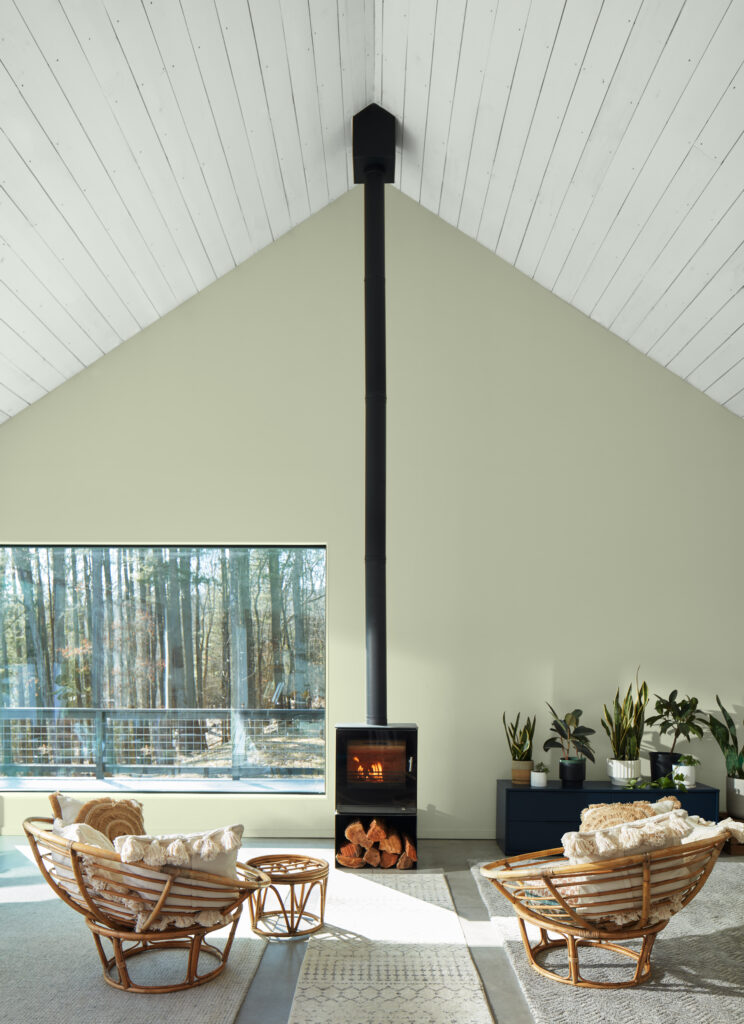
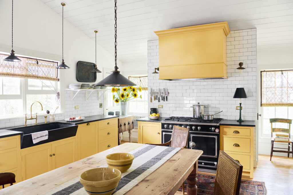
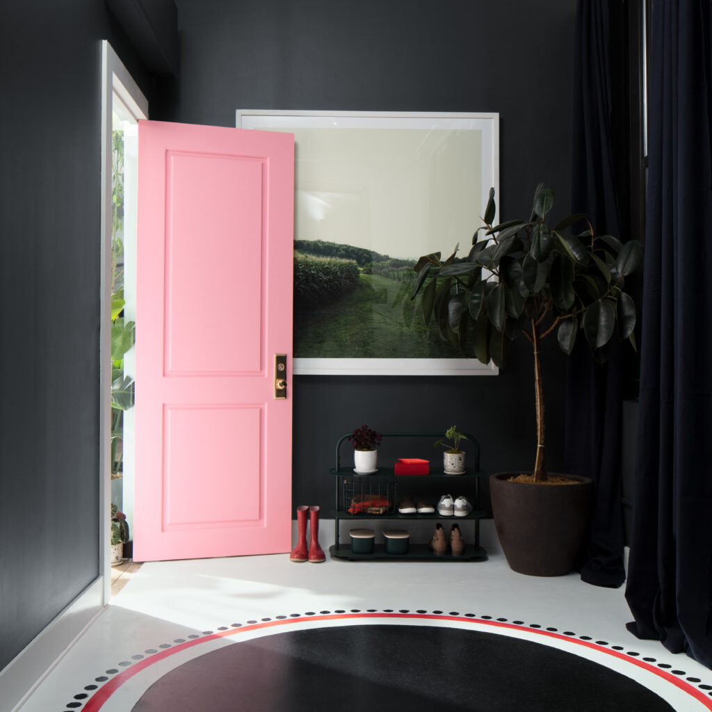
Maximalism
After several years of neutrals dominating color selections, self-expression and a willingness to indulge in color creates the backdrop for spaces designed in a maximalist style. Bold, saturated hues that are unapologetic and exuberant delight the eye while making an impactful statement. Both large and small spaces benefit from the desire to bring personality and fun into the home, resulting in memorable rooms that are sure to tell a visual story.
Saturated colors, whether deep or pale, drench spaces demonstrating a willingness to play with color and explore unique color pairings. To enhance the vibrancy and character of these hues, crisp white, and a navy so deep it is almost black provide contrast, heightening the dramatic looks associated with maximalism.
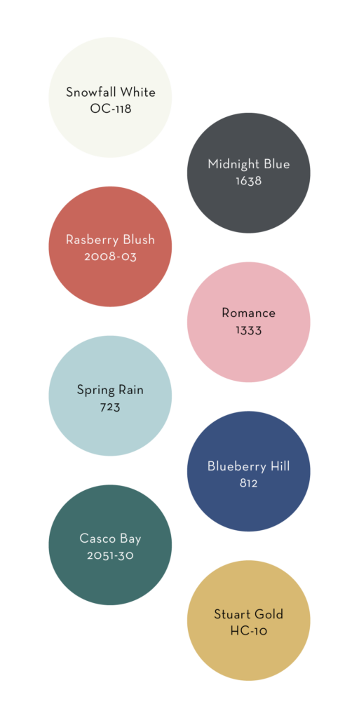
Painted using Stuart Gold HC-10
Snowfall White OC-118:
For a pristine white, Snowfall White is an ideal choice in its ability to maintain a slight touch of warmth, while remaining crisp enough to pair well with bright colors.
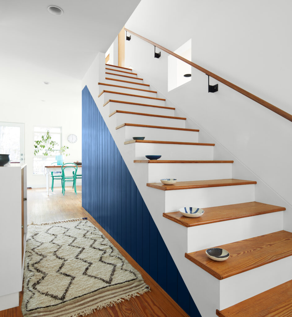
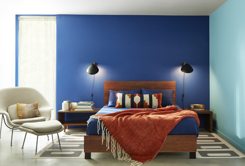
Midnight Blue 1638:
This intriguing blue is just a step away from black, resulting in a hue that is slightly softened while maintaining a wonderful depth.
Painted using Midnight Blue 1638
Raspberry Blush 2008-30:
This vivacious coral brings charisma and energy to a room, making the walls a main event filled with personality.
Romance 1333:
A mid-tone pink that makes a bold statement even with a small dose, especially when paired with super deep hues, or fresh white.
Spring Rain 723:
For a crisp sky blue that falls at the lighter end of the mid-tone blues, this color has personality while evoking a clear summer sky.
Painted using Blueberry Hill 812
Blueberry Hill 812:
Infused with a touch of violet, this saturated blue takes a step away from a true primary that is sure to stand out.
Casco Bay 2051-30:
This deep teal hue takes its inspiration from the colors of the tropics, creating an effect that is both dramatic and soothing.
Stuart Gold HC-10:
A vibrant gold hue often associated with traditional interiors remains modern through its boldness and ability to bring unexpected color to an interior.
Influenced by Nature
Whether relaxing at a seaside retreat, taking a walk on a trail through the woods, or looking out over a snowy vista in the mountains, nature is a strong source of color inspiration for our homes. The colors of our natural surroundings are familiar and comforting, with an air of stability reassurance that gives a rooted feel to interiors. Particularly as lines between interior and exterior living spaces continue to blur, nature-inspired hues draw connections to the myriad of colors found in the sky and earth.
With sustainability and respect for our natural surroundings top of mind, both warm and cool colors reflected in nature never fail to deliver rooms that are welcoming and soothing, with rich deeps that bring timeless elegance to a home.
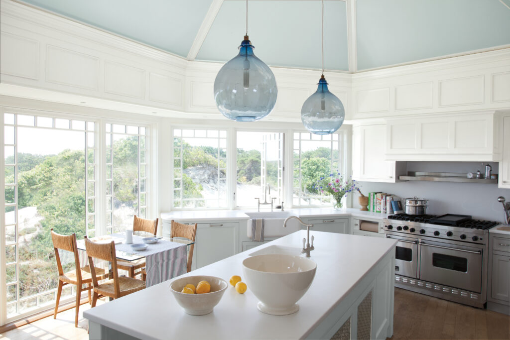
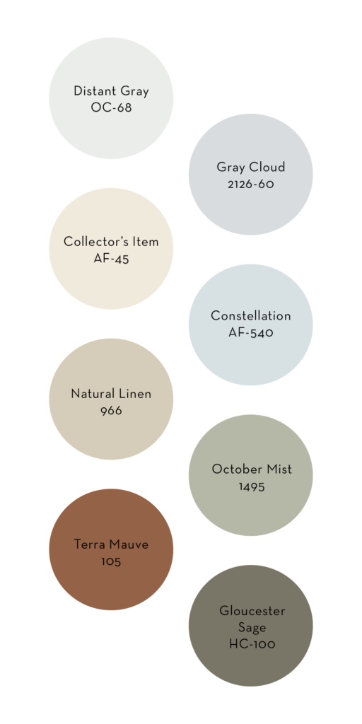
Painted using Distant Gray OC-68, Constellation AF-540, and Gray Cloud 2126-60
Distant Gray OC-68:
A classic bright white with a touch of blue-gray that pairs well with hues on the cooler side.
Gray Cloud 2126-60:
This pale gray has a soft blue undertone, creating an ethereal sensibility.
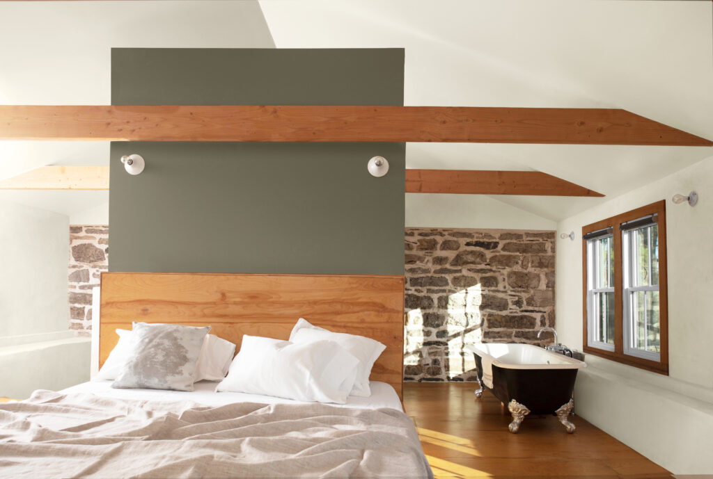
Painted using Collector’s Item AF-45 and Gloucester Sage HC-100
Collector’s Item AF-45:
This off-white balances the right amount of cream and then a slight touch of pink, making this a flattering and flexible color.
Constellation AF-540:
A pale blue with a dreamy quality, this hue is an ideal choice when just a hint of color is desired.
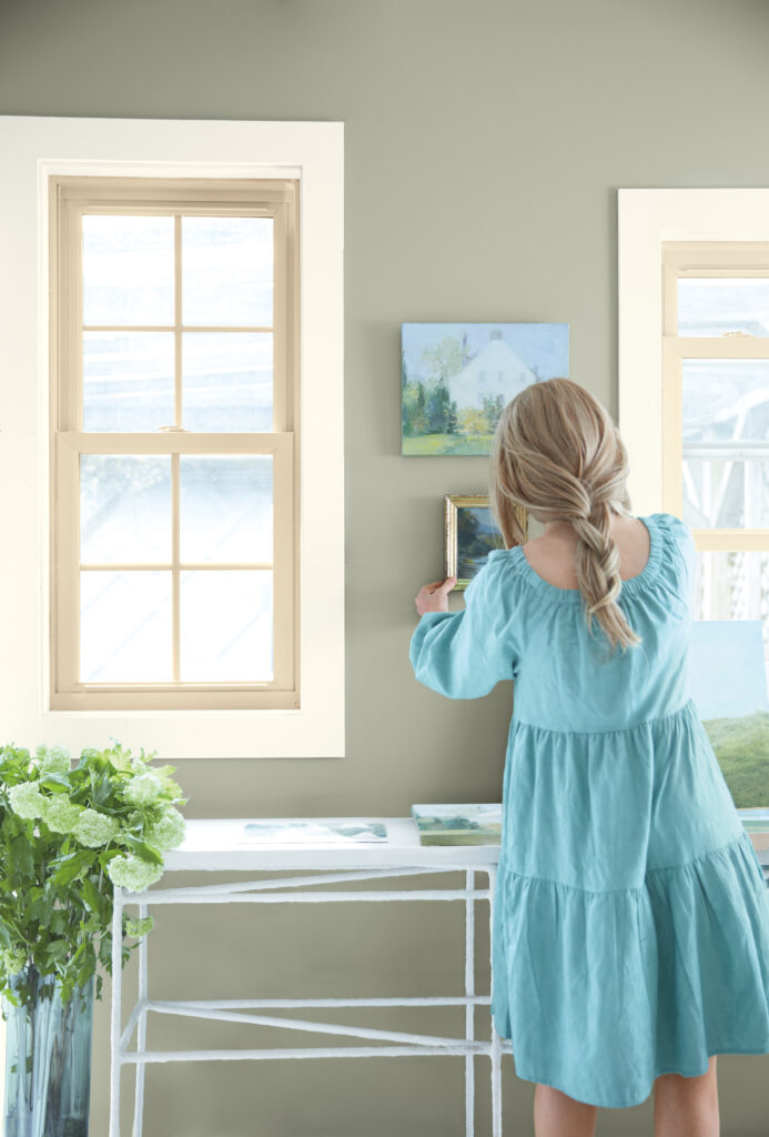
Painted using October Mist 1495, Natural Linen 966, and Collector’s Item AF-45
Natural Linen 966:
True to its namesake, Natural Linen is versatile enough to be both a rustic and elegant color schemes.
October Mist 1495:
This gently shaded sage brings a hint of gray to a pale green, anchoring rooms without losing an uplifting quality.
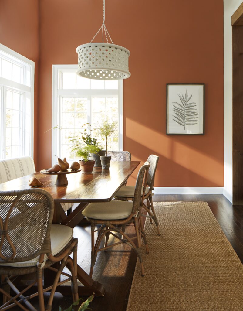
Painted using Terra Mauve 105
Gloucester Sage HC-100:
A hue that conjures mossy greens, Gloucester Sage has the right amount of earthy depth and welcoming appeal.
Terra Mauve 105:
This color takes its cues from rich clay hues with warmth and an understated sense of luxury.
Story by Andrea Magno, Benjamin Moore / Photos Courtesy of Benjamin Moore
Subscribe to TABLE Magazine‘s print edition.
